
Spotwork Web App Redesign

Problem Statement: Users are having an increasingly difficult time navigating and viewing information on the current web app
Goals
User Research
Key Findings and Pain points
Personas
Journey Mapping
Mockups
Compiled feedback from 30+ customers who were using the current web app.
Selected 10 customers for 1-on-1 interviews and usability testing for common tasks performed (creating a position, posting a shift, hiring workers, confirming timesheets), encouraged users to think out loud and provide honest feedback.
Managed goals, constraints, and expectations with stakeholders.
High Fidelity Prototypes
User Feedback
Sign in screen

Navigation Menu

The Spotwork web app was built for companies as a workforce management web app. The first iteration was a design that began with basic simple functionality, but as we gathered feedback from new users and stakeholders, we added numerous features on top of the original design. This presented several issues as the original design had to accommodate for additional functionality. Not to mention evolving business objectives. The key issues were in its layout, information hierarchy, and content filtering, which began to get increasingly confusing for users.
This redesign was built using the newly developed design system; Currie, to address the aforementioned problems. The goal was to address the pain points users experienced, and additionally, increase efficiency in use, load times, and modernize its look, so that users can come on to the app and learn how to use it faster than before, decreasing their reliance on our support. This was done while balancing the needs of the users and the needs of the business, to ensure that the solution was feasible and effective.


Usability Testing
After ironing out any issues with other designers, developers, and product manager, we brought prototype to our users. Usability testing was done through specific tasks on the web app, such as creating a position, posting a shift, hiring workers, and confirming timesheets for workers. We followed up with 1-on-1 interviews to get their overall response on how they perceived the overall changes in design and user experience. The results were overall positive, and time on task was reduced by an average of 25%. While the users took time to understand and learn how to use the new web app, they reported that it was more intuitive and much more simple to use compare to the previous version. Based on their feedback, we iterated and refined the design until it met their needs and expectations.
Implementation
Applicants List Overlay

Position Creation Form

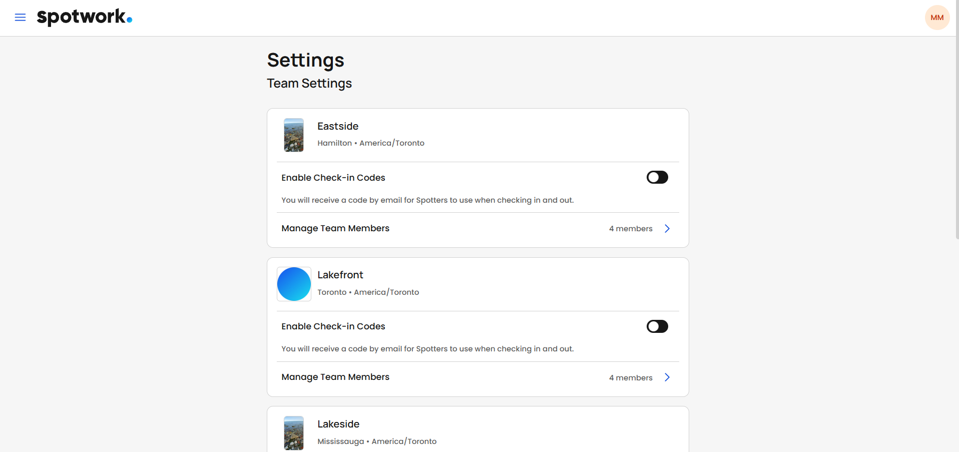
Working closely with the development team, I made sure that the designs were accurately translated into the final product. Below are some screenshots of the final working product.
Dashboard

Shifts Schedule

Timesheets

Settings
Outcomes
We have begun to roll out the new web app to our users and so far there have been many positive comments regarding the web app’s clean aesthetics and overall usability enhancements. We will continue to ask for feedback and make adjustments as needed to further improve its user experience.
The wireframes and low fidelity prototypes were transformed into functional high fidelity prototypes, which allowed us to interact with the designs and get a good feel for how it worked. This gave us the opportunity to identify any potential issues or areas for improvement before testing with our users and other stakeholders.


Design
Final Results
Initial User Feedback
Susan, who ran a small warehouse that needed 3-4 workers weekly
John, who needed 10-15 seasonal workers for a few months at a time out of the year
Initial wireframes and mockups were created based on the journey map and personas, taking into account the importance of information hierarchy. It was crucial that we maintained the parts of the original web app that users enjoyed while seamlessly blending in new features. As well as experimenting with different layouts, navigation paths, menu options, and colour combinations. Other factors included adhering to accessibility standards and considering diverse user needs.


Project length
July 2024 - February 2025
Roles
UI/UX Researcher and Designer
1.) Decrease user reliance on support for help using the web app by improving layout, navigation, and information hierarchy
3.) Reduce time on task and bounce rate for users
4.) Update outdated appearance using new design system
Research and Insights
2.) Allow users to scale up the number of workers hired more efficiently
Common theme amongst users was that they felt that they had too many interactions to complete a task and navigation between pages could be better (example: to manage a user’s created positions took 4 button clicks to get to).
Some information was hard to see at a glance or not where they expected it to be (example: in order to make room on data tables, some information needed to be hidden)
On smaller viewports the data tables would not resize to fit, causing them to need to side scroll (example: on viewports smaller than 1280x960, data tables will extend beyond the edge of the browser)
Wanted to easily hire many workers at once (example: users wanted to send out mass job offers for more day at a time)
Overall appearance could be more polished
Journey maps were created to visualize the user experience and identify any potential roadblocks they might run into.